Interior Design for an Apartment with a Patio in El Born
Light, joviality, warmth and multifunctionality. These are some of the adjectives that define and describe the latest Coblonal project, located in the middle of the Born district, in Barcelona, and custom-made by a young future chef from Barcelona.
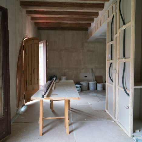
The project we have had on the table in our study is a comprehensive reform of a flat, which has an original surface of 146 m2, 2 double bedrooms, 2 bathrooms, a kitchen with apple open to the living-dining room and a terrace of 76m2. It is located in one of the urban centers of Barcelona: the Born district. It is a space full of symbolism, not only because of the location where it is located, but because of the current context of the owner. And this flat is a remarkable milestone for our client: it is the first property owned by this young Barcelona resident and cookery student. A scene that will be remembered for a lifetime.
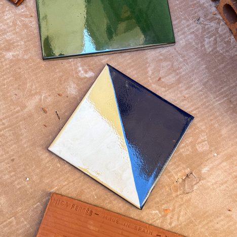
Although the space is designed to embrace, in essence, a single person, one of the requests that our client made was to rethink the zoning and distribution of the space so that the floor appears open, diaphanous and allows for easy movement between the different zones that structure it. Following the footprint and the characteristic seal of Coblonal, the reformulation of this house has been carried out based on the respect and conservation of the essence and identity of the space, playing with the original and handcrafted materials that they make up (in this particular case, brick walls, green glazed ceramics and the traditional latticework, among others).

The welcome cocktail: a dining room with natural elegance
The dining room of this project appears as the presentation letter of this space. This is an area that offers a first taste of the essence and style of the rest of the house, and is integrated into a volume that fuses and exudes style, elegance and functionality.
To dress up the space, we chose to use natural fiber wallpaper to cover the walls and ceiling, and thus achieve a unique and welcoming texture that created an atmosphere of calm and warmth. In addition, among the elements that dress the space – all carefully selected – the linear lamp model Ambrosia, from the Marset brand, stands out, which appears as a central item and bathes the atmosphere of the dining room in warm light.
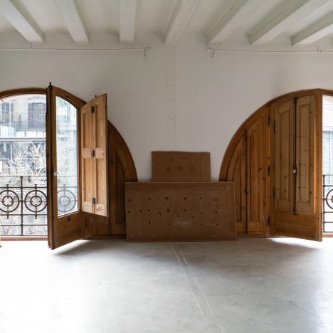
To respect the character and essence of the dining room, we have preserved the original woodwork, witnesses of the building’s past, which integrate into this space and create, as a whole, an area that preserves authenticity and distinctive symbolism of the original space.
The aperitif: the room, warmth and comfort cooked over a slow fire
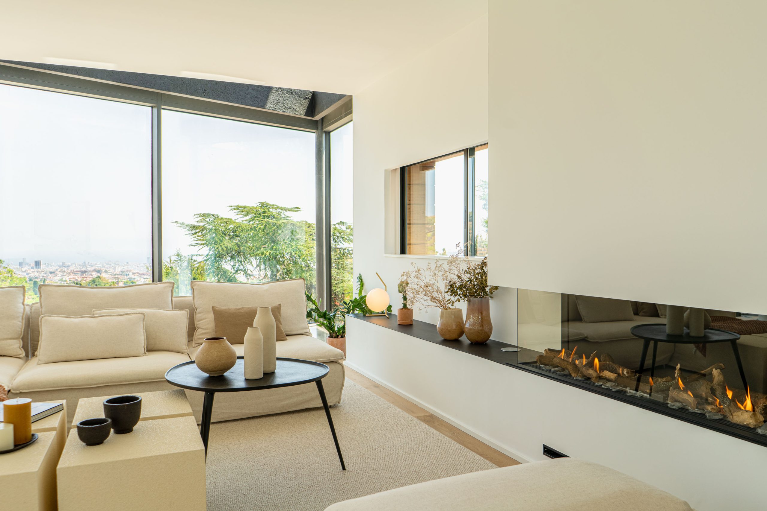
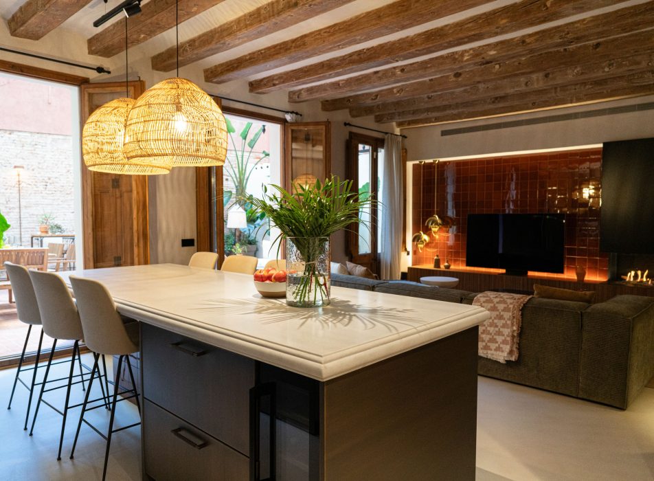
Strategically open to the terrace and the kitchen, the room exudes warmth, sophistication and comfort. It appears as a space interconnected with two of the large areas of the flat – the kitchen and the terrace – and is bathed in natural light coming from outside. It is, therefore, a small capsule of comfort and style that we have chosen to dress up with an “L” shaped sofa upholstered in sage green textile.
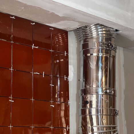
Undoubtedly, the most impressive element of this room is the fireplace, which is clad in the distinctive traditional brick ceramics of Ceràmiques Ferrés, and rests on a custom-made piece of walnut wood.
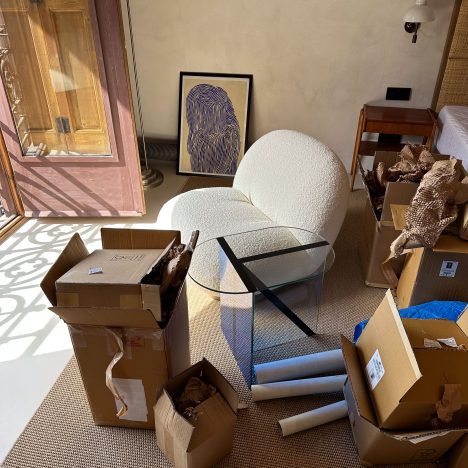
In front of the fire, an invitation to sit, stop and rest: a Pachà model armchair and two suspended standing lamps of the Multi-Lite model and in golden tones. Both elements are from the Gubi brand and bring exclusivity to the space.
To finish, we sealed the room with two OLO model tablets, from the MOOG brand, which create an aesthetic and practical balance.
As a whole, then, the room exudes a unique warmth, and each piece, chosen with precision and care, gives this area of the floor its own identity that transforms it into a haven of sophistication and comfort.


The starters: the kitchen, an ode to good taste
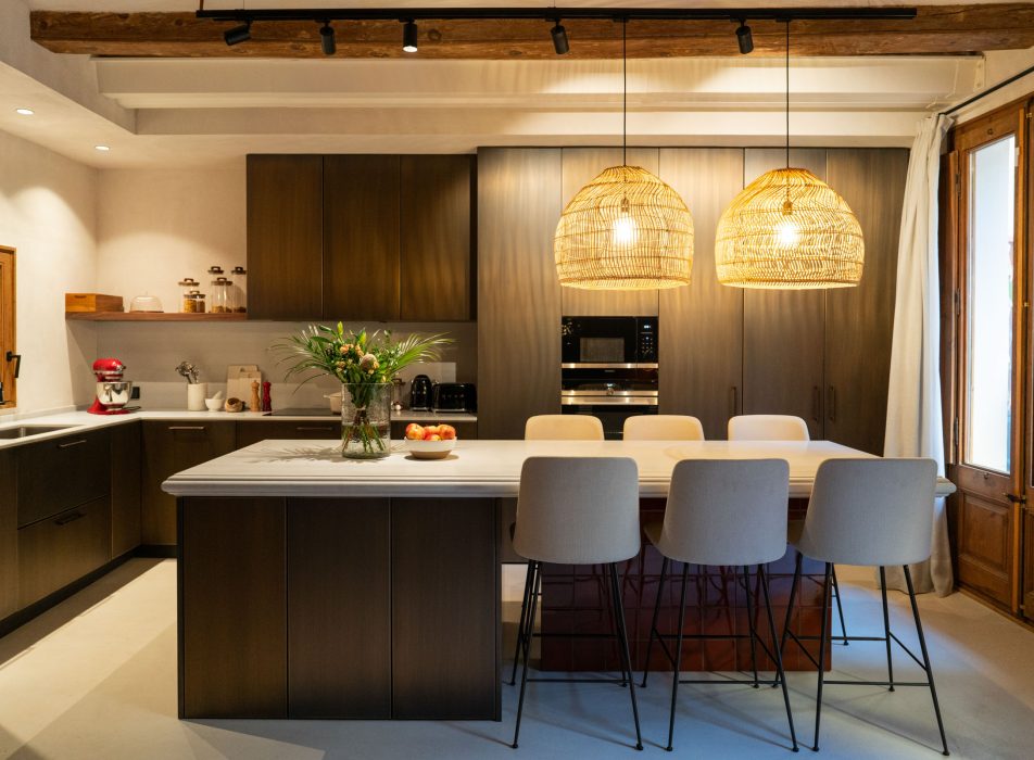
It was clear from the beginning that the kitchen would become the epicenter of the home, the core that had to reflect a young girl’s passion for gastronomy. And the design and structuring of this space is not simply functional: it is also a tribute meticulously planned to satisfy the needs and aspirations of a future chef. A stay able to mold itself to the culinary creativity and ambition that our client wants to express.
Based on this essential premise, every corner that makes up this unit is calculated down to the millimeter so that it fuses elegance with functionality.
At the distribution level, the kitchen appears open to the living room and the terrace. In the middle, we have arranged a central island made of country white marble. The cupboards that surround this area of the floor are clad in brushed brass, giving the space modernity and warmth. To unify and harmonize the design of the kitchen, we have incorporated the same tobacco-colored ceramic tile at the base of the island and the front wall, thus promoting consistency and visual continuity.
In essence, and taking into account both the unique stamp of the renovated space and the needs of our client, we have formulated a kitchen that transcends the practical function and becomes a sanctuary that celebrates the art of gastronomy in a space magazine equipped with top-of-the-line tools and materials.
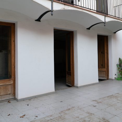
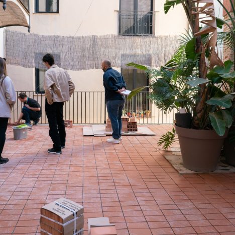
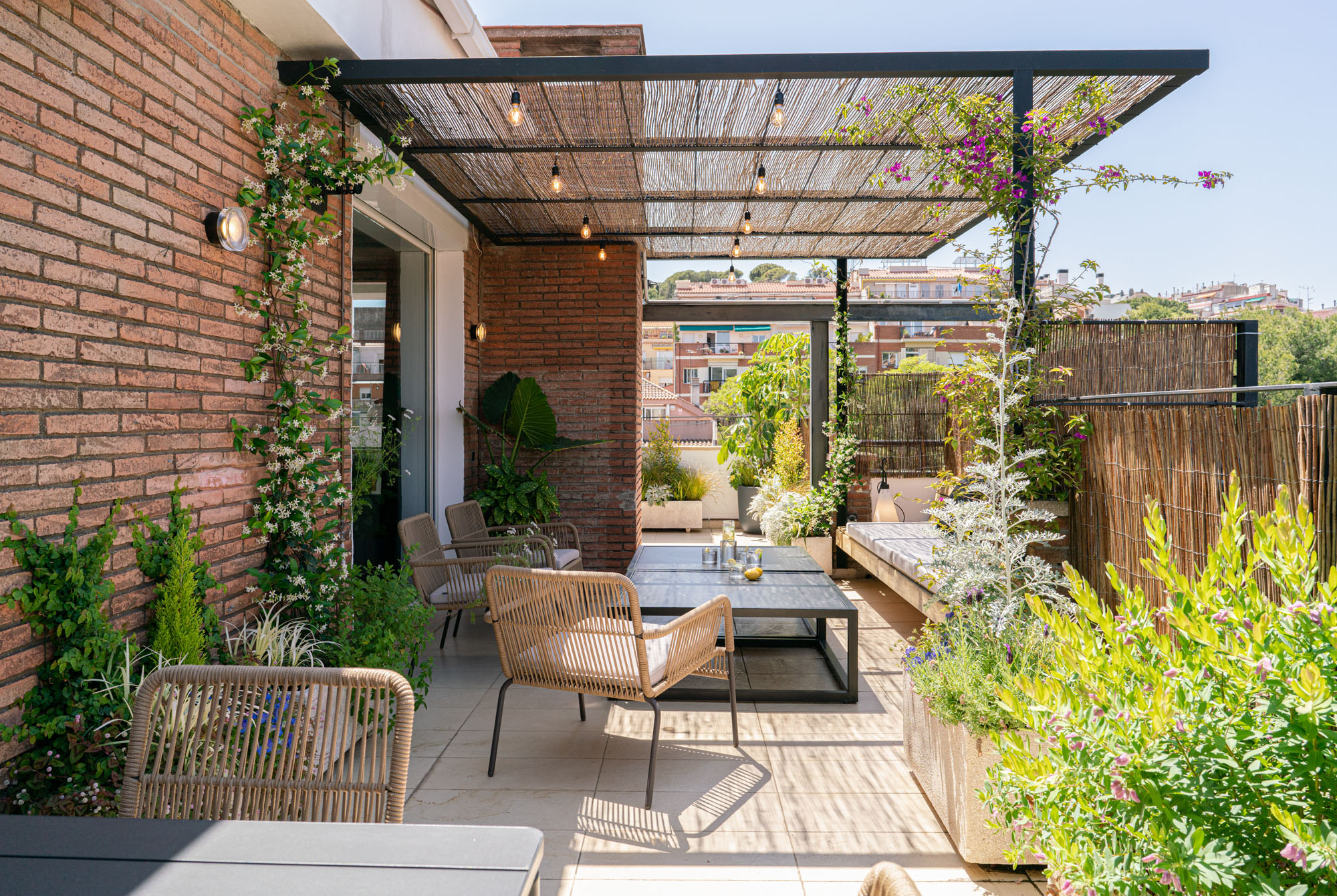
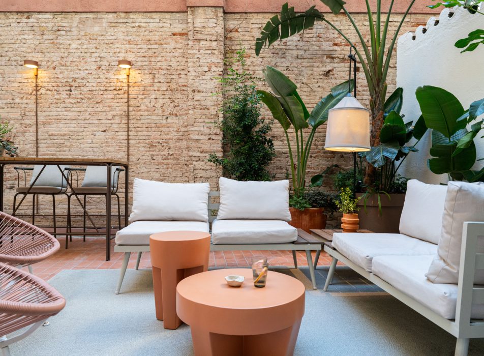
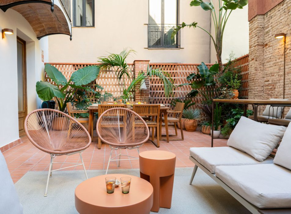
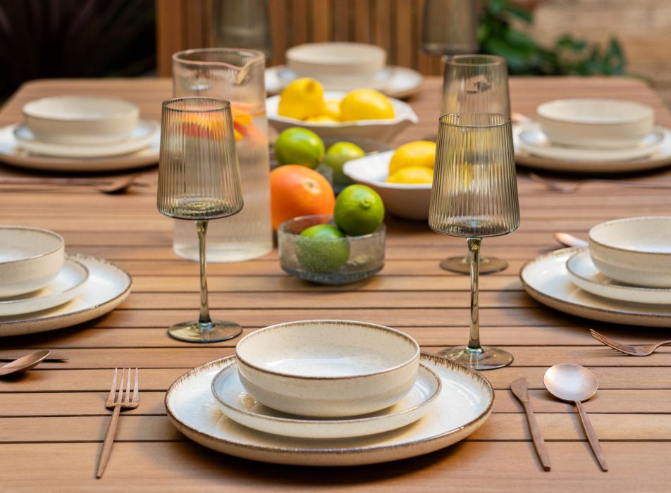
First course: the terrace, an outdoor oasis Two wooden and iron gates give way to this small oasis of calm in the middle of the city, and connect it directly to the kitchen and the living room. In this open-air setting, there are 3 distinct areas: the first area is an elegant dining room, dressed from a large wooden table and chairs that invite you to enjoy outdoor dinners under the Born sky from barcelona Next to this dining room comes the second area of the terrace: a bar area with two high stools that create the perfect setting for impromptu cocktails.
To finish, and collecting this unit, the lounge area is the one that steals the limelight of the space. It appears dressed with two cozy sofas in white and cream tones, a central wooden table and two armchairs that exude comfort and convenience.
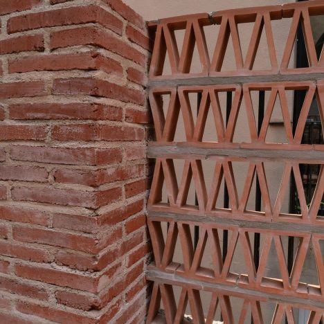
In the equation, we have also integrated one of the terrace’s star elements: a Montgrí model lattice, by Ceràmiques Ferrés, which visually delimits the space and creates a unique play of light and shadow. It is an interesting element to play with because it acts as a light filter and generates a visual game that transforms the terrace into a bright area during the day and into an intimate and collected corner at dusk.

Second course: the suite, a sophisticated duality of calm and versatility
If we could define the suite on this floor with one word, the concept of versatility would be the one that best defines it. And it is that one of the premises that our client specified was to sectorize the bedroom to receive visitors.
Starting from this point, pencil in hand, we propose a distributive proposal that would be chameleon. In this sense, we have created a rest area that can be transformed into two double bedrooms thanks to a custom-made sliding door with walnut wood and wallpaper. Playing with this element has made it possible to enhance the adaptability of the space to the current needs of our users.
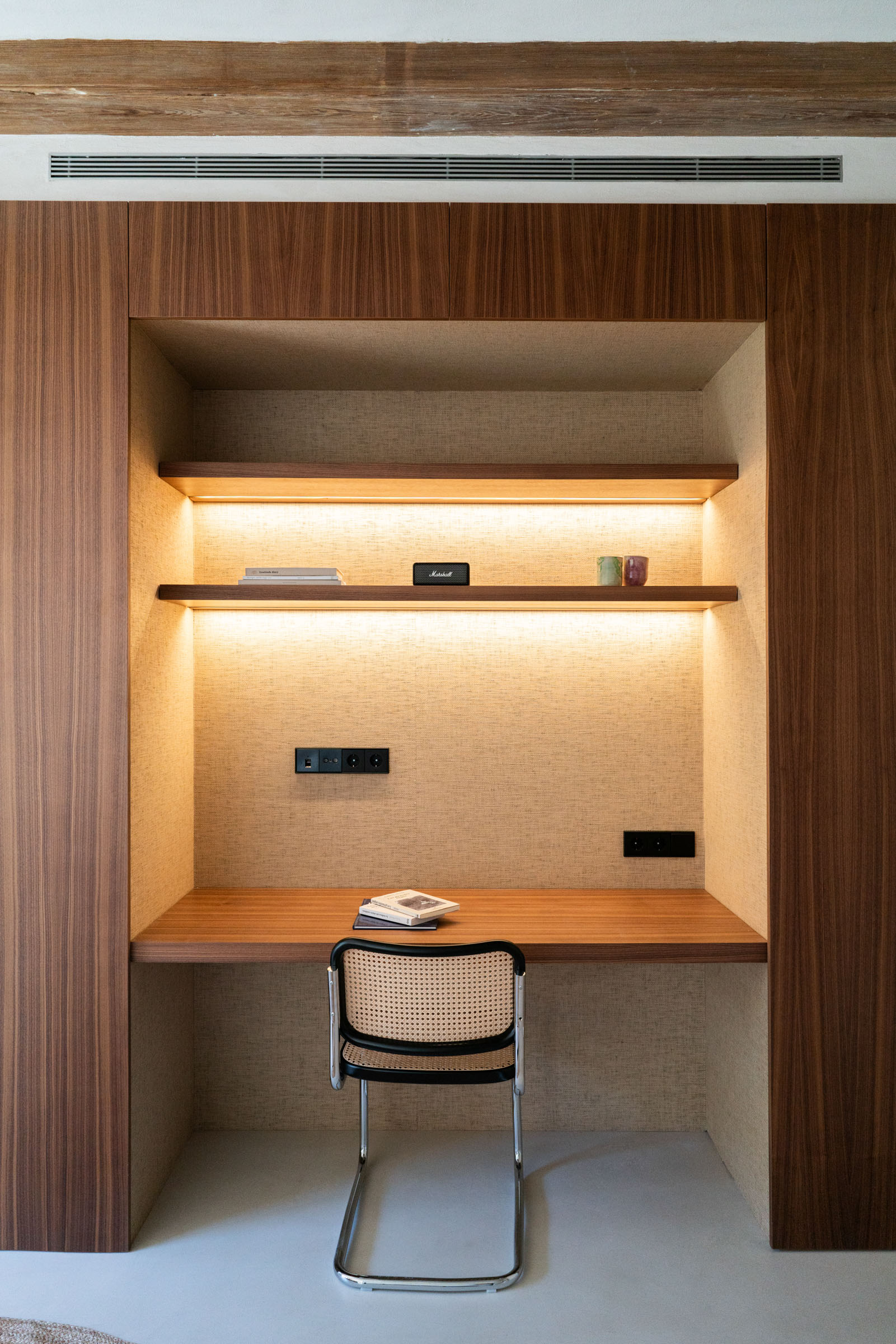
In addition, the heart of the suite houses a walnut wood volume that not only serves as a storage unit, but also incorporates a desk area. The division of space through this structure is an intelligent arrangement that responds to a duality of functionalities.
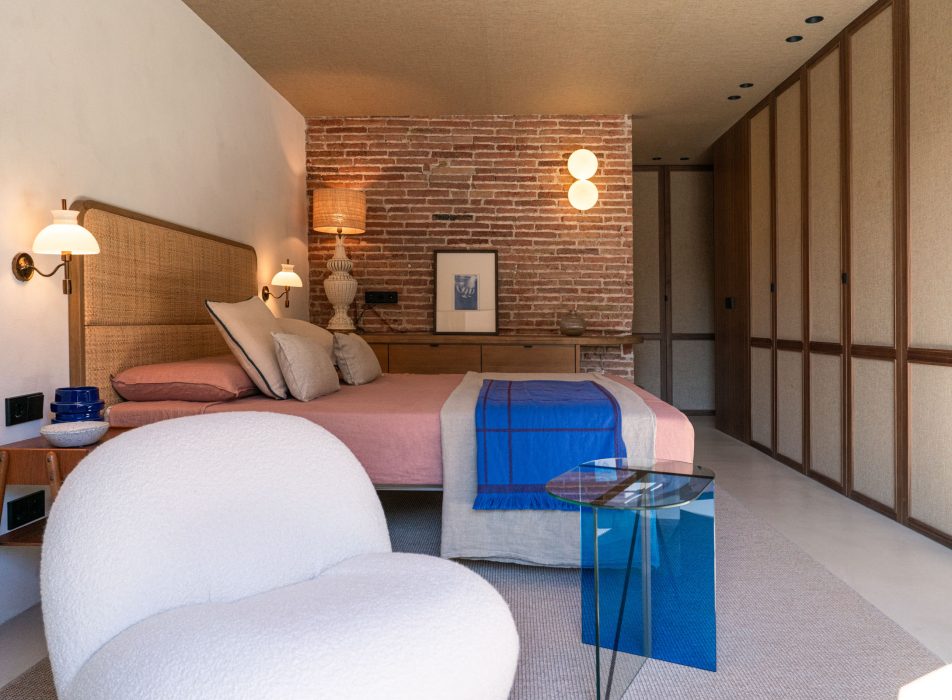


As for the second bedroom, it is created thanks to a folding bed that is camouflaged inside an off-white lacquered volume. This additional corner offers a resting space and, in parallel, a study area where we have incorporated a sofa and a custom-made wooden bench, thus creating a versatile and multifunctional area.
It should be noted that the light flows naturally thanks to the restoration of the original windows, which we have turned into porticos that frame a magazine image of the Born market.
Right next to this postcard landscape is the master bed: it’s a double mattress flanked by two vintage bedside tables and sconces.
All these elements appear accompanied by a Pachà model armchair, from the Gubi brand, and a Scarab model table from the Gofi brand, bringing a sophisticated touch to the space. In addition, and as a final colophon to the suite, we have also incorporated a dressing area with a made-to-order pine chest of drawers that spans the original salvaged brick wall.
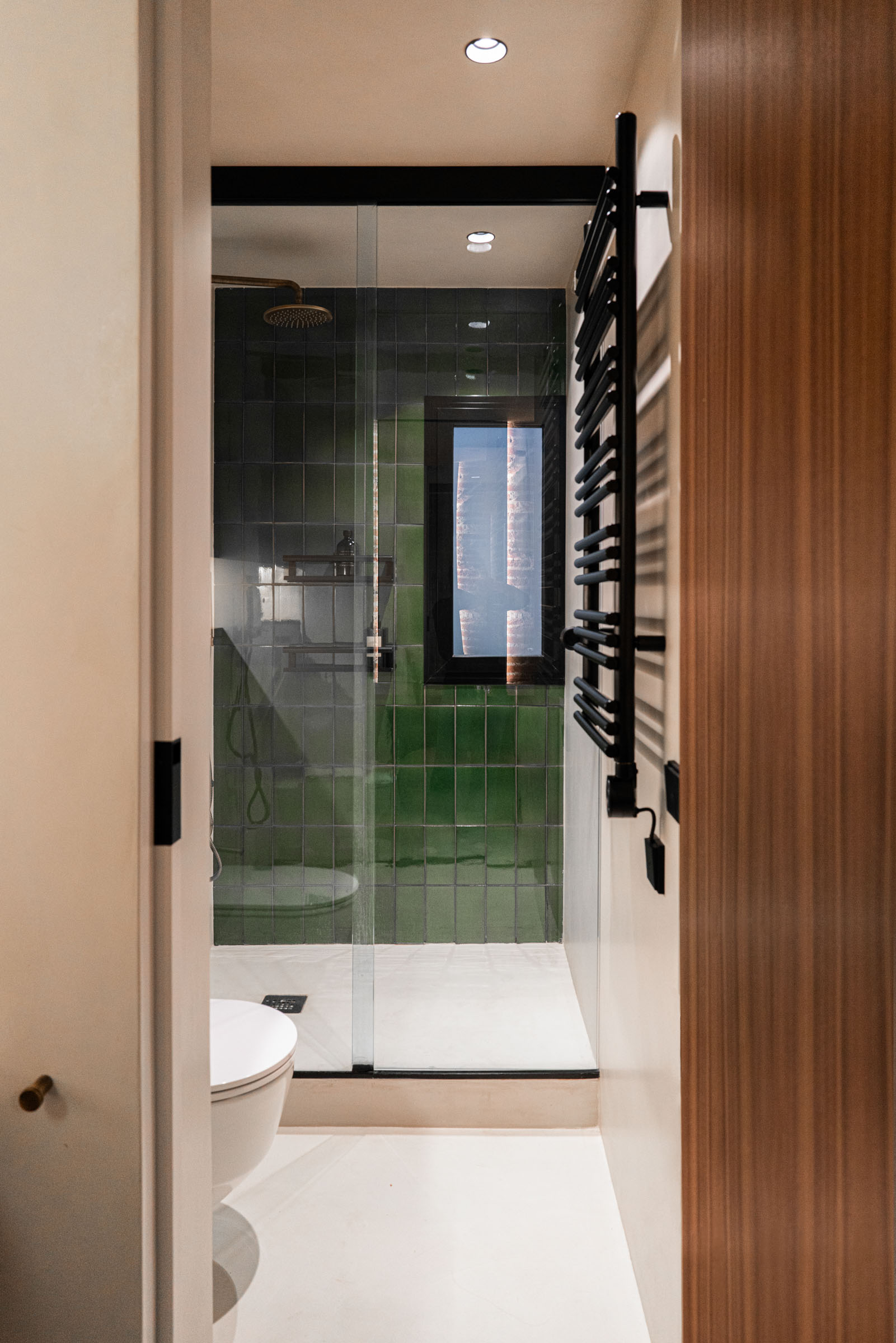
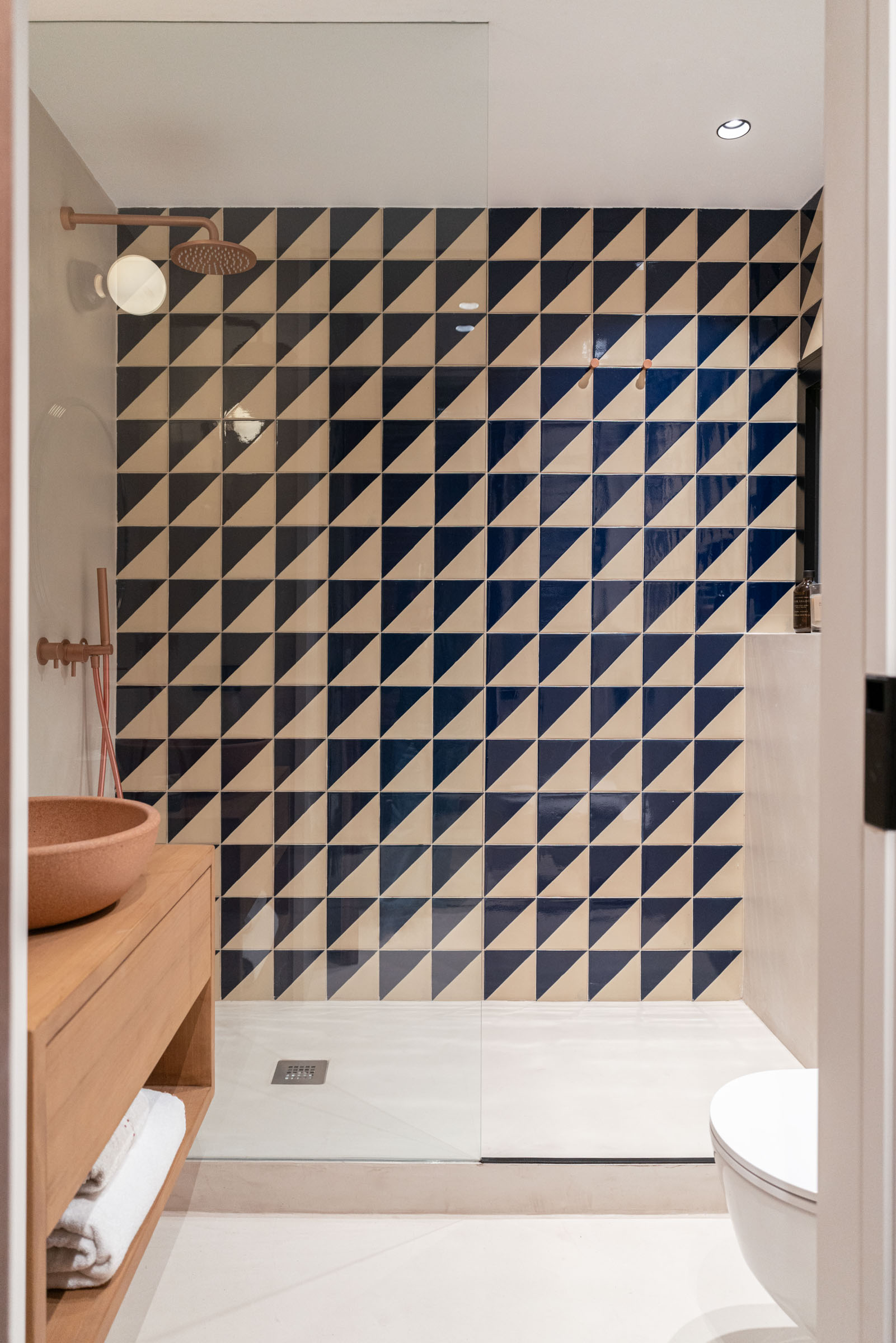
This scenario takes us to the most intimate point of the suite: a water area that gives the exit to the bathroom, lined with microcement. This area shines on its own thanks to the golden faucet present, which gives luxury and sophistication to the space. Within this unit, the lining of the shower, made with green glazed tile, stands out.


Contemplating and pampering down to the millimeter every detail is our flag.
A premise that, again, can be seen reflected in the hand-washing area, where there are suspended illuminated and custom-made mirrors and where the prominence of the FLOS brand sconces is indisputable.
All in all, the suite on this floor presents itself as a space that not only welcomes and embraces rest, but also celebrates comfort and elegance in perfect and balanced harmony.

In essence
So, we could summarize the latest Coblonal project as a balanced equation of design and functionality, in which each space tells its own story. Each corner becomes a multifunctional area that denotes style and adaptability: from the kitchen with the marble island with brass details and which materializes the owner’s gastronomic passion to the living room, with the fireplace and vintage elements , encapsulates the essence of this home, or the suite that redefines versatility with an ingenious division nurtured with personalized details, present in both the bedroom and the bathroom.
Ultimately, this project embodies the connection between the building’s history and the present. All this, framed with spectacular views of the Born market through restored original windows. It is an apartment that emerges as a testimony of creativity, elegance and exclusivity, and where every detail has been carefully thought out to be part of the unique and exquisite experience of living in a fairytale setting in the heart of Barcelona.

Photographs by: ©Heidi Cavazos
Distribution plan

