Interior design for the Lobelia and isardSAT offices
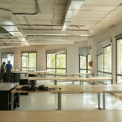
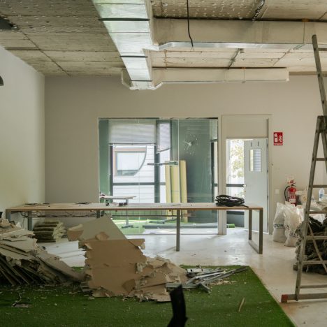
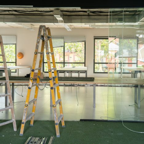
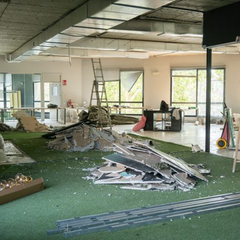
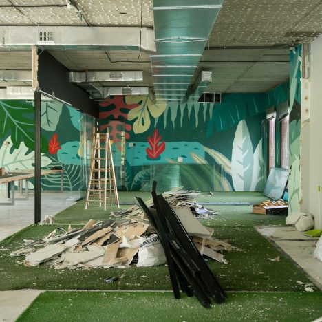
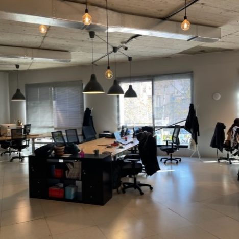
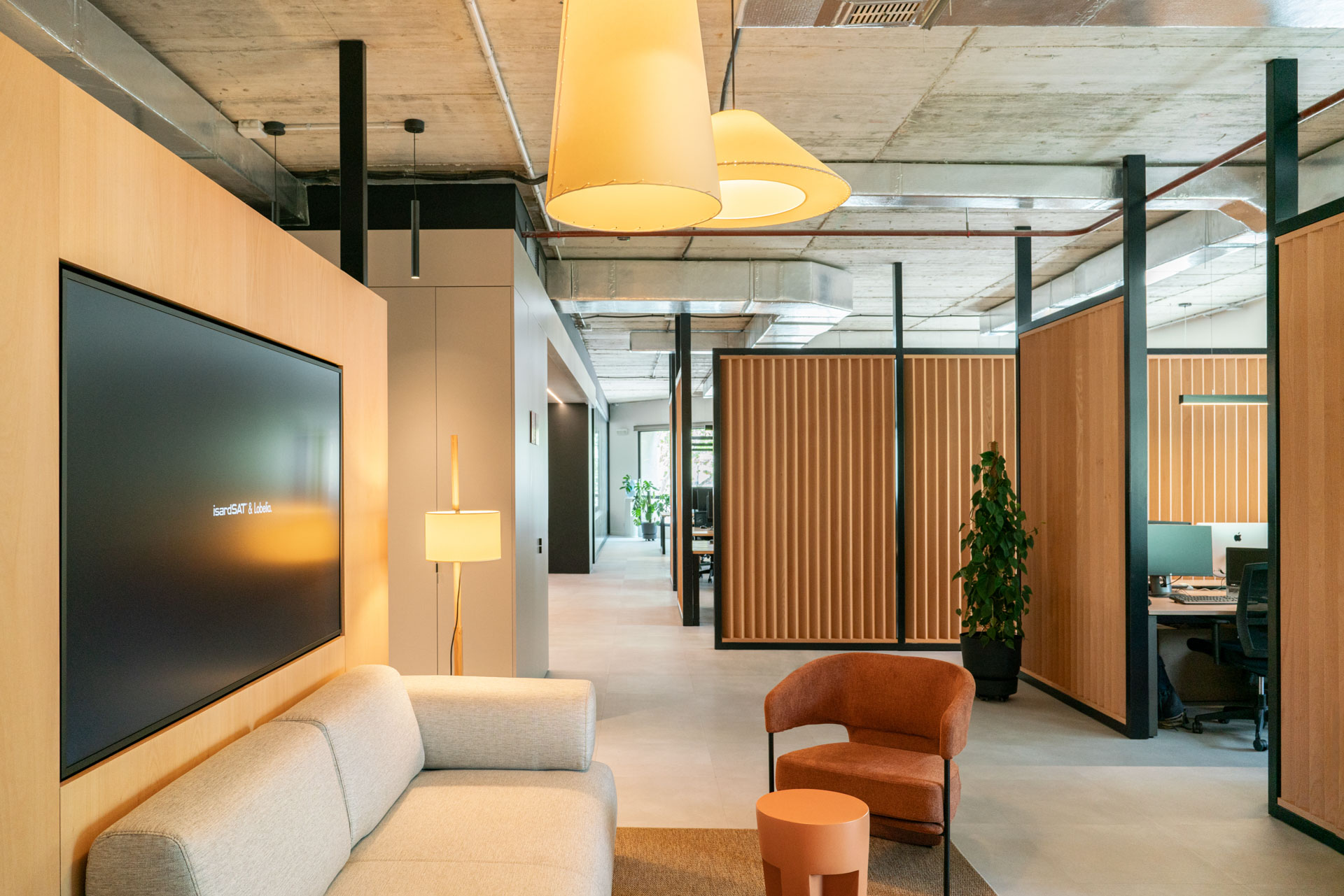
In the heart of the Poblenou district, in Barcelona, is our latest project: some old 440m² coworking offices that we have completely transformed to create a modern and functional workspace, designed for the technology company Lobelia and isardSAT .
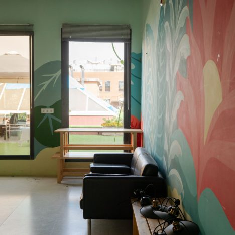
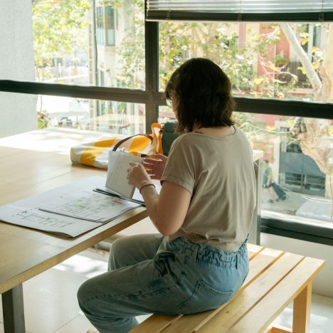
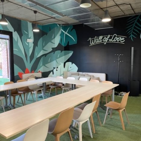
Far from the cold and impersonal stereotypes common to tech offices, this project opts for a warm and welcoming design that seeks to make workers feel at home. A new office concept that combines functionality, aesthetics, warmth and comfort, resulting in a space where technology and comfort go hand in hand.
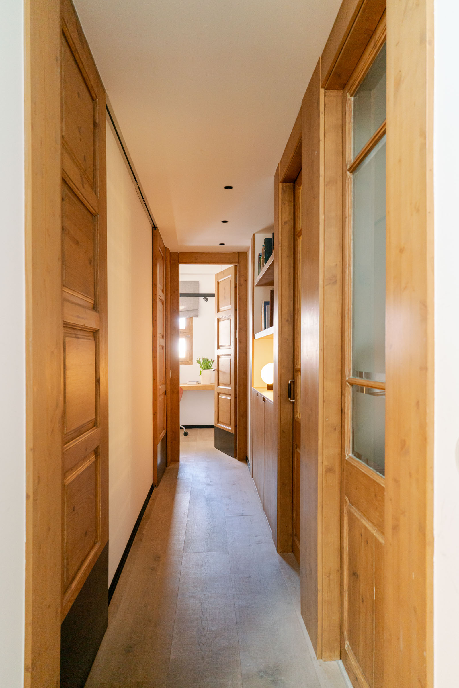
With neutral tones between grays and earths, terracotta reds and details in oak wood, the spaces are designed to promote the well-being of employees. This proposal marks a before and after in the design and distribution of these offices.
Comprehensive redesign: from coworking to offices
To achieve a space tailored to our clients, the first step was to analyse their philosophy.
Lobelia works in Earth observation and climate models to assess vulnerabilities, risks and opportunities associated with climate scenarios. On the other hand, isardSAT develops scientific and engineering projects with the aim of being a leading company in passive and active microwave remote sensing and a preferred partner within the field of Earth Observation research.
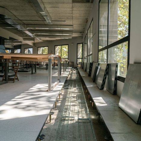
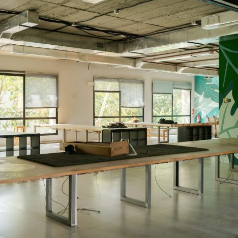
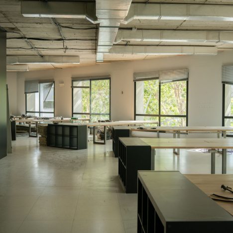
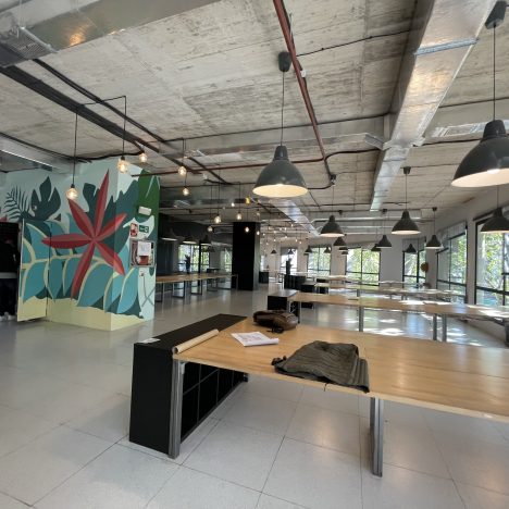
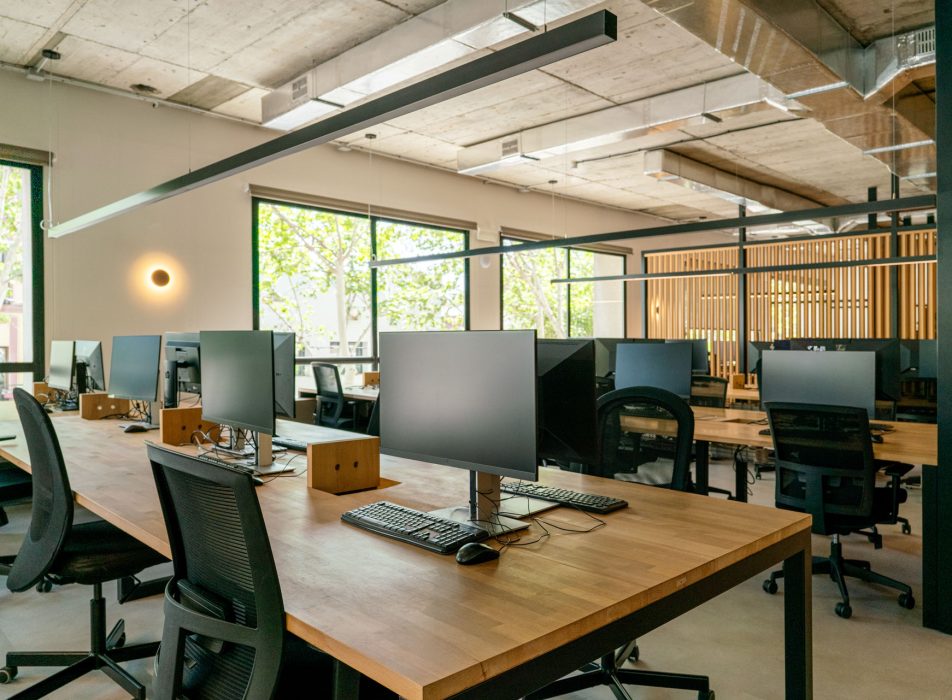
On a material level, the slab has been left exposed, leaving the grey colour of the concrete itself exposed in the natural. It has been an intelligent strategy that, as a whole, contributes to maintaining chromatic coherence throughout the space.
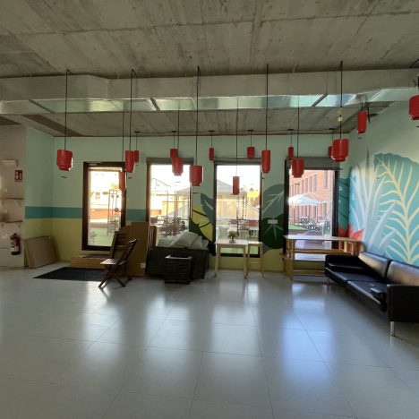
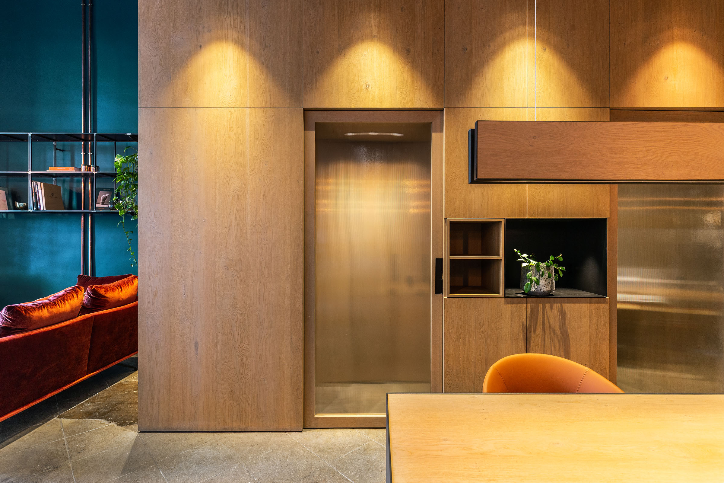
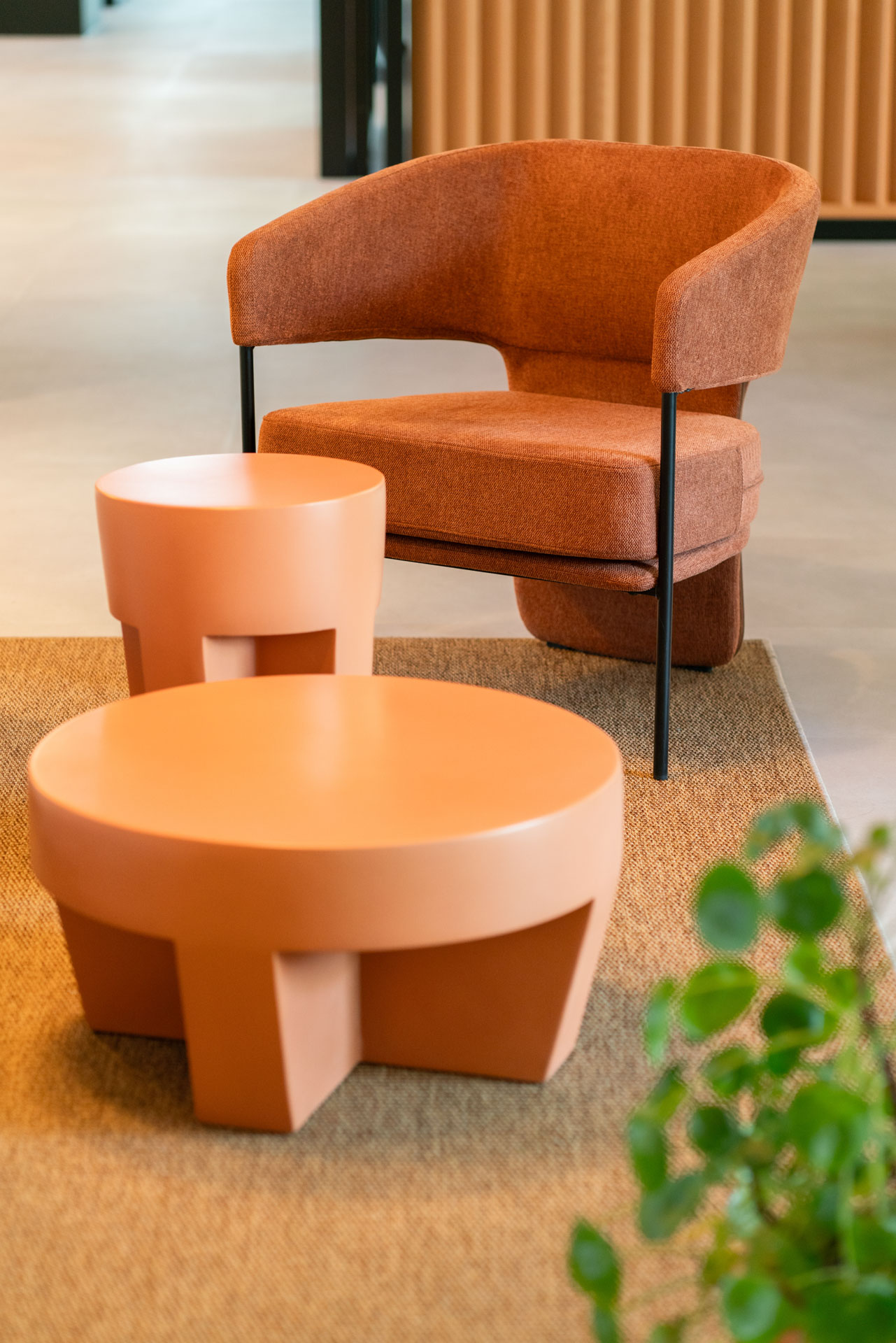
By analogy with the soft tones, we have added details in oak wood. As for the furniture, we have integrated pieces in terracotta and reddish tones, such as the coffee tables in the entrance and the kitchen chairs, incorporating small touches of colour that do not overload the whole and bring life and dynamism to the whole.

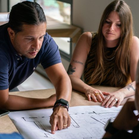
The starting point for this project was an office previously dedicated to coworking. We completely redistributed the space, combining common-use spaces that allow interaction between workers with private spaces that facilitate concentration and independent work.
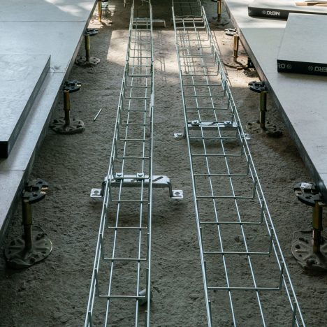
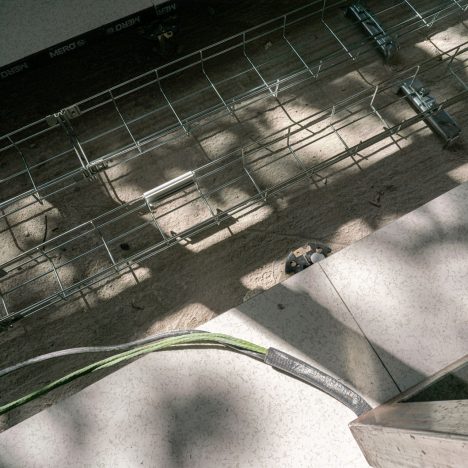
At the architectural and facilities level, the transformation has been comprehensive. In this sense, we put on the table a new distribution proposal, with substantial improvements in equipment, and always with the aim of providing workers with the best tools for their daily work.
Despite being a technology company, the project seeks to escape the typical futuristic and impersonal image that is often associated with this type of technological spaces. In this sense, we have dispensed with some characteristic elements such as blue LED lights, stainless steel and cold and minimalist aesthetics.
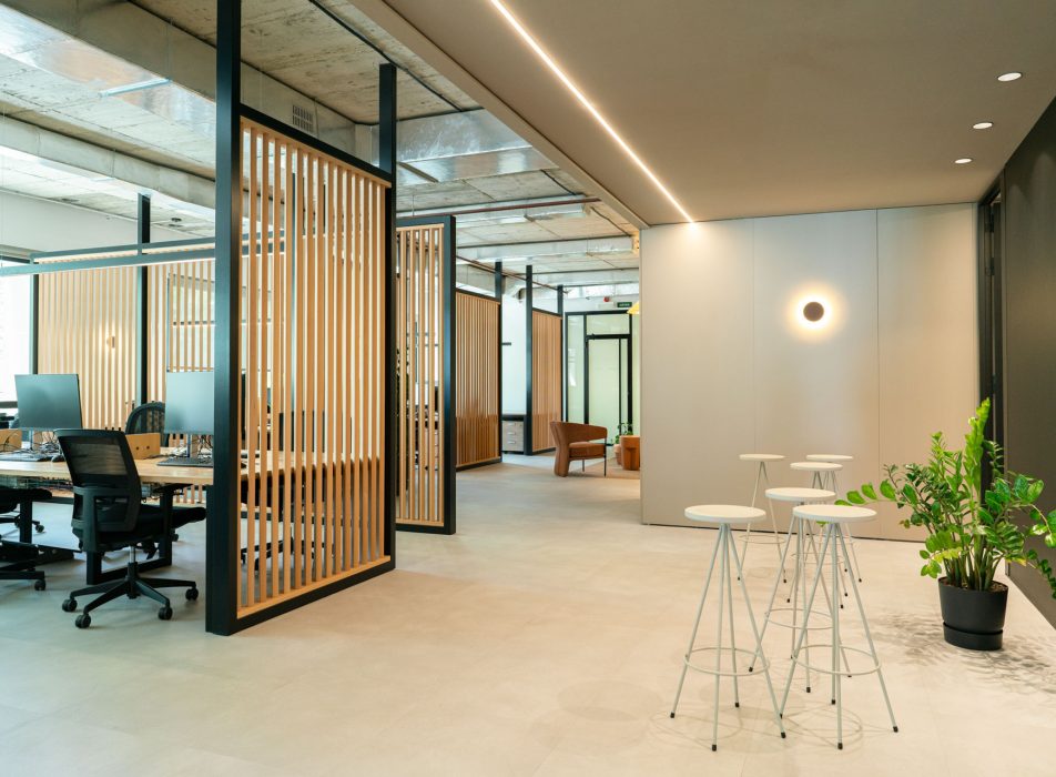
To achieve this, we opted for a colour palette based on soft grey tones and stone, present both in the floor and in our iconic “Coblonal box”, a distinctive element that we incorporate in most of our projects. The point of saturation is given with details in terracotta red colours.
At a material level, the slab has been left exposed, leaving the grey colour of the concrete itself exposed in the natural light. It has been an intelligent strategy that, as a whole, contributes to maintaining chromatic coherence throughout the space.
In analogy with the soft tones, we have added details in oak wood. As for the furniture, we have integrated pieces in terracotta and reddish tones, such as the coffee tables in the entrance and the kitchen chairs, incorporating small touches of colour that do not overwhelm the whole and bring life and dynamism to the whole.
The welcome area: a reception that invites you to stay
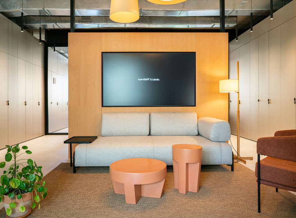
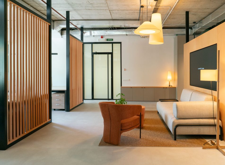
The first contact with the office is essential to convey the essence of a company. To convey this warm and friendly image, we designed this welcoming space with furniture and lighting for domestic use.
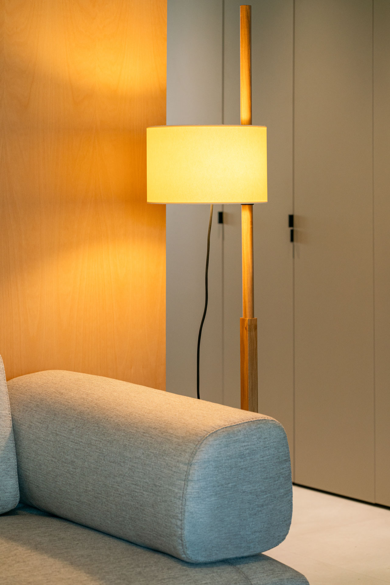
We have equipped it with a sofa, an armchair, a coffee table and a screen integrated into a vertical oak wood wall. The collection of hanging lamps model Sísisí, floor lamp TMM and table lamp Básica stands out. All from the Santa&Cole brand.
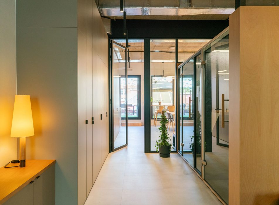
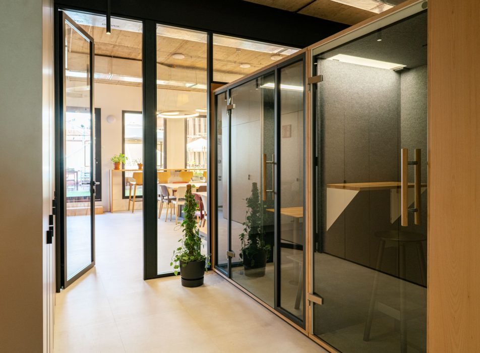
To preserve order in the space, a small area has been incorporated so that visitors can leave their coats and bags. In parallel, at the back of the reception, we have integrated two individual soundproofing booths and two double ones, designed to resolve acoustic issues and avoid disturbances or interference during calls or video conferences. They are small capsules that offer privacy to employees, without sacrificing the visual harmony of the entire space.
Work area: duality between open and closed spaces
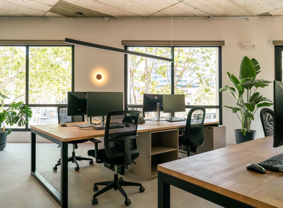
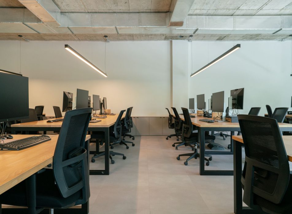
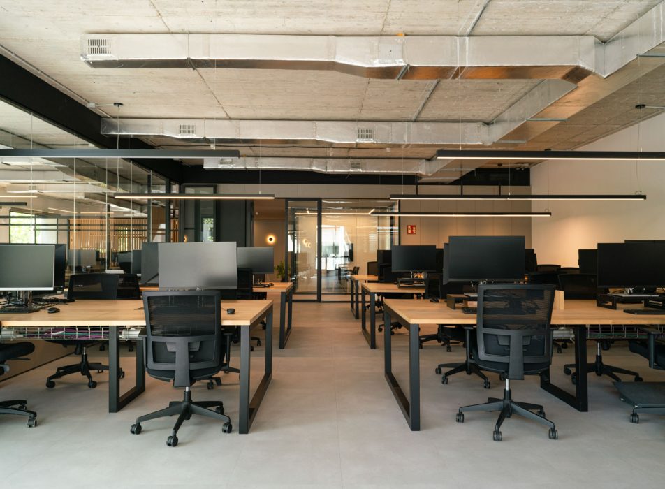
This is the space that occupies the largest part of the surface area and is designed to accommodate the individual and cooperative work of employees. In this area we have incorporated our distinctive distribution element: the “Coblonal box” which, in this case, covers the area intended for group work.
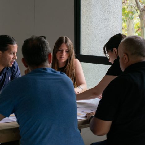
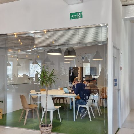
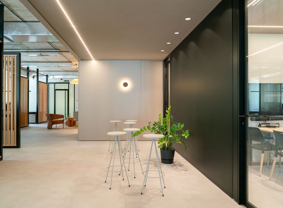
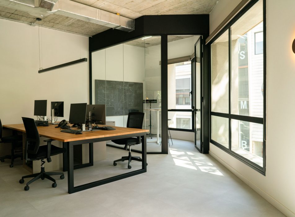
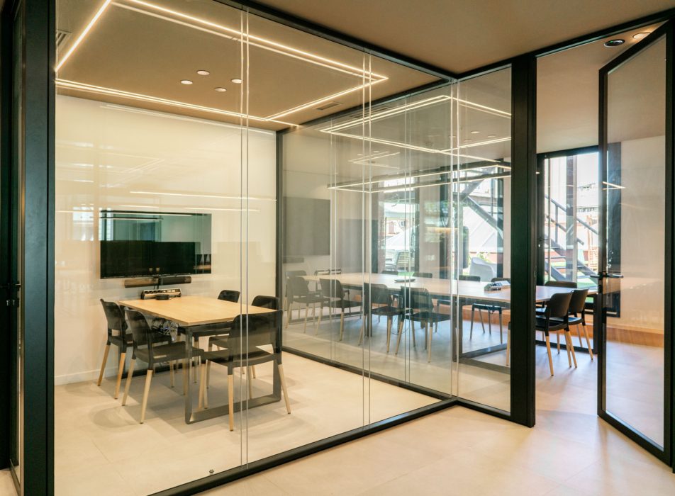
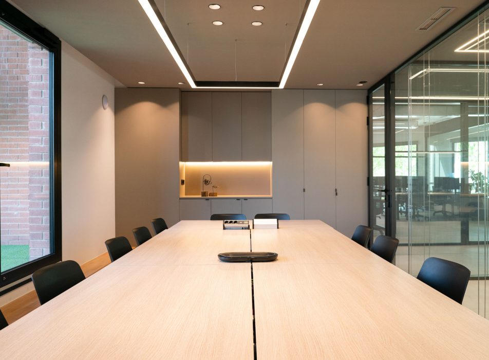
In the centre of the space there is a classic plaster board, accompanied by high stools. It is a space designed so that workers can carry out cooperative work in a comfortable and agile way. Around it, we have arranged three meeting rooms: two designed to accommodate four people and one for sixteen. All of them are equipped with oak tables and black chairs.

A custom-made lighting proposal
A key aspect to highlight in the work area is how the lighting has been designed. In the meeting rooms, we have designed a custom-made solution based on an LED strip of lights integrated into the ceiling that frames the perimeter of the space. This resource creates a clean and smooth visual effect, without protruding elements and allows the light to be distributed evenly. In addition, a suspended lamp has been placed in the largest room, designed exclusively for this space, which reinforces the sophisticated aesthetics of the space.
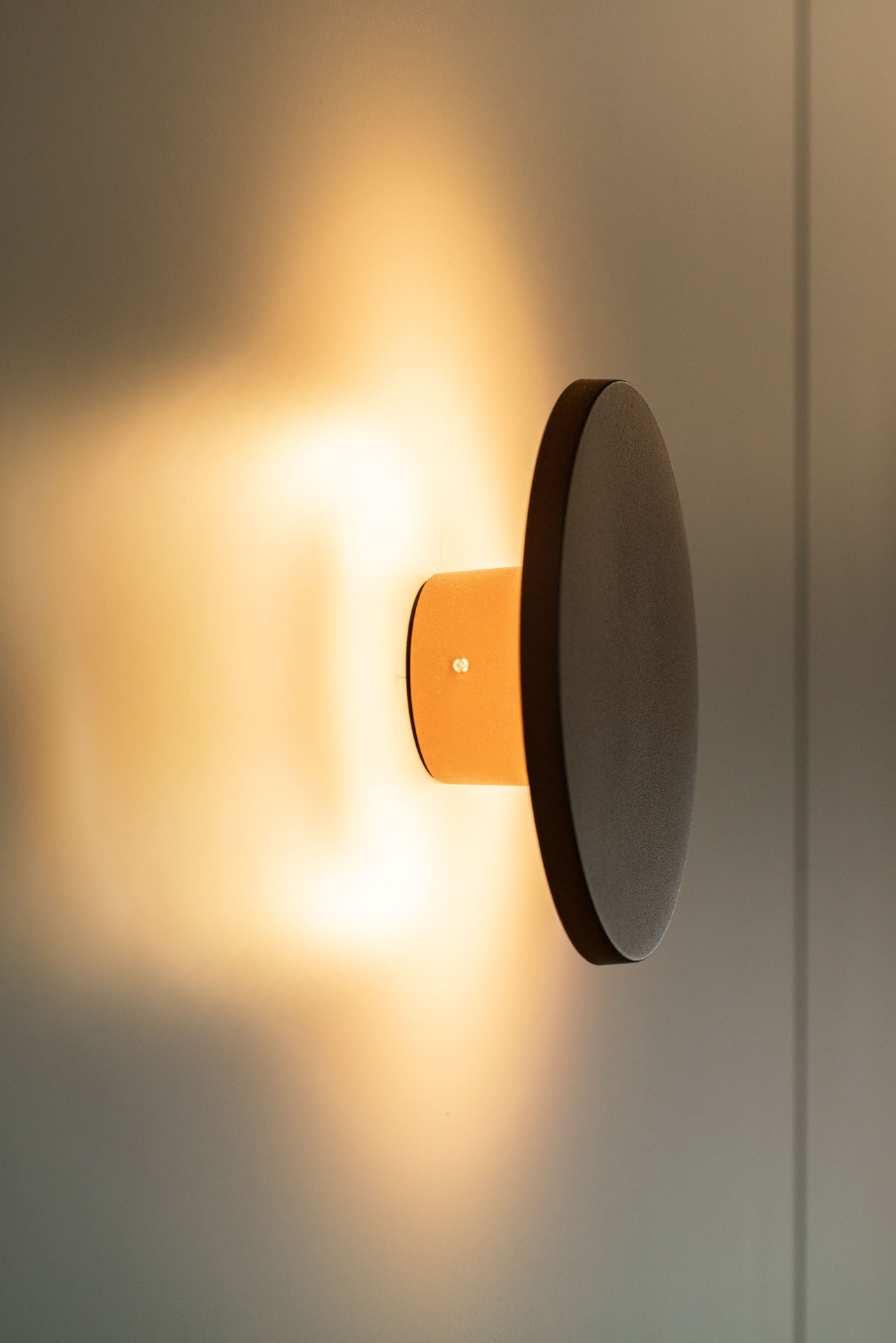
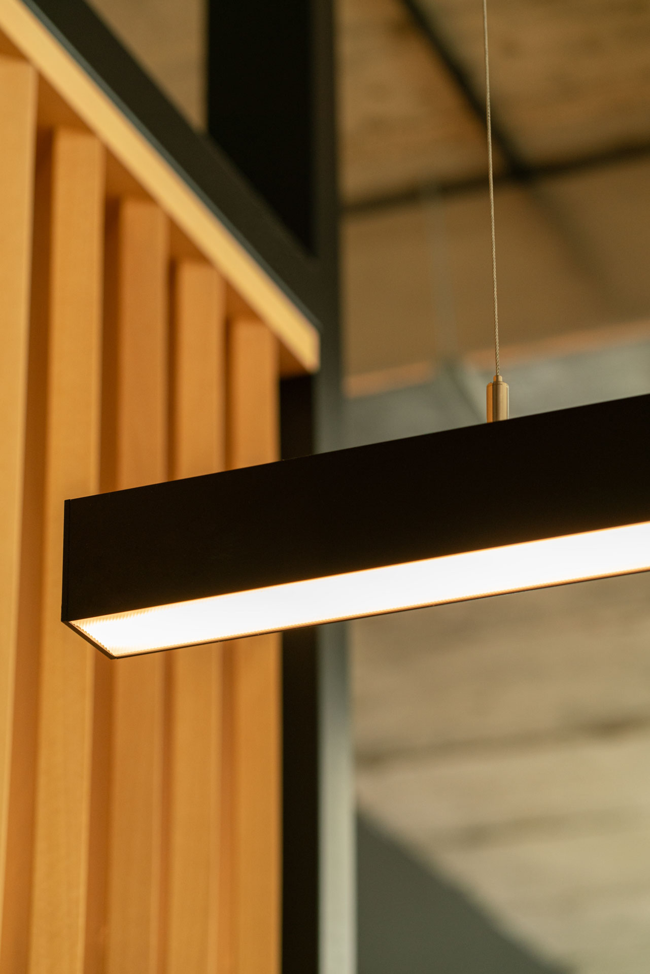
As for the linear lamps suspended in the work area, they incorporate a sensor that allows the intensity of the light to be regulated according to the time of day, thus improving the quality of the work environment. Additional lighting comes from wall lights, interesting pieces, as they provide visual balance and indirect light.
The kitchen: an invitation to pause
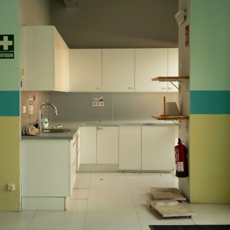
One of the essential spaces that cannot be missing in any office is the kitchen. For this particular project, we have designed a kitchen with the essential equipment so that workers can comfortably enjoy their meals.
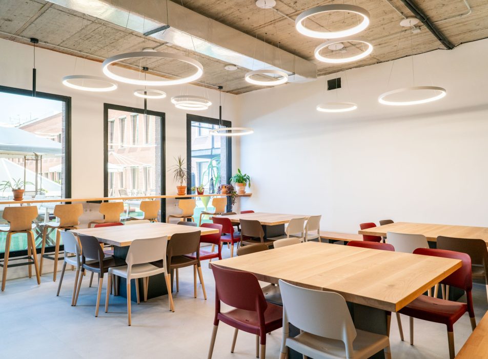

The space is divided into two main areas: one with stools and direct views of the terrace, and another with a dining room equipped with four tables for eating comfortably and finding a moment of rest. To enhance the warmth of the space, we have once again opted for oak wood for the furniture, following the chromatic line of neutral tones.
It should be added that the kitchen is separated from the rest of the office by a glass enclosure with black profiles. In this way, we have managed to create a closed and private space that prevents odors from passing through to the work area.
Separation and privacy: the design of a visual closure
To divide spaces and offer privacy in the different work areas, we have designed dividers made with a black metal structure and fixed oak wood slats.
These wooden slats appear strategically inclined to facilitate and maximize the entry of natural light without compromising the luminosity of the space. It is an effective solution that creates a feeling of visual privacy without having to resort to closed dividing doors.
In addition, as it is placed close to the entrance of natural light from the façade, it creates an interesting play of light and shadow.
Final overview: a warm workspace with its own stamp
The redesign of these offices is a clear example of how to transform a space to meet the needs and desires of a technology company that seeks to break with stereotypes. We have managed to create a warm, functional and balanced environment in which workers can feel comfortable and motivated within their work environment.
From the reception area to the kitchen and work spaces, every detail has been carefully thought out to be consistent with the company’s values.
The colour palette, based on grey and earth tones and details in terracotta red tones, together with a careful choice of materials such as oak wood or metal in a black finish, provide a feeling that is far from the coldness so typical of the imagination of tech offices.
Thus, this project seeks to create spaces that are not only aesthetically pleasing, but also improve and facilitate the daily experience of those who use them.
If you are looking to transform your space with a design that balances aesthetics and functionality, do not hesitate to contact us for personalized advice.
Follow us on our social networks and check out our blog for more ideas and inspiration!
Photographs by: ©Heidi Cavazos
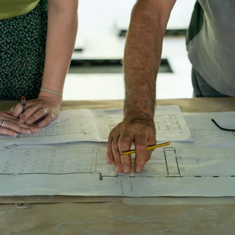
Distribution plan


