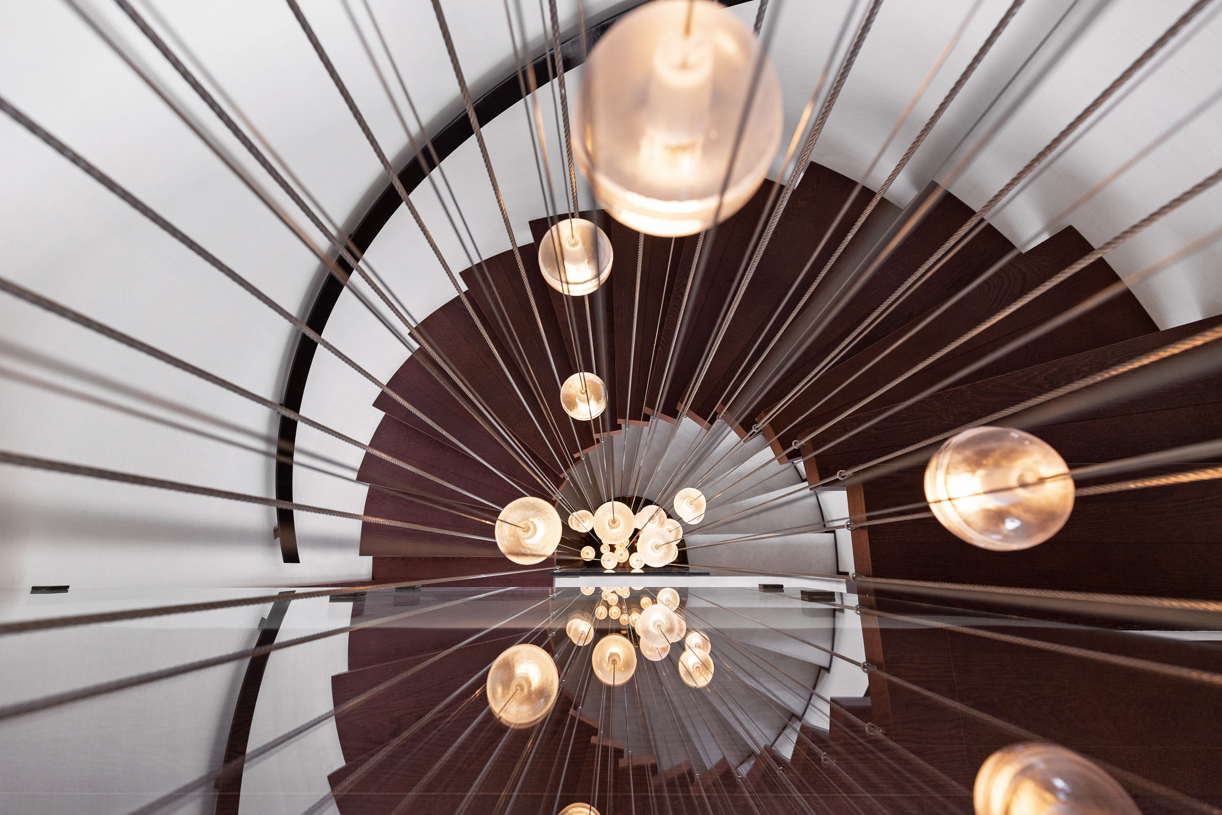
Rule of 60, 30, 10:
It is one of the most used resources within professional interior design. It mainly consists of applying the color in the space in percentages: 60% will be the base color. For example, a stone color that we could apply to the walls and ceilings.

30% will be another color that we could find, for example, in the pavement, which could be an oak wood.

A last 10% will be what is called accent color. A trick to apply this rule without running a lot of risk visually, it is to use a neutral base and set in the colors that will predominate the most in the space and opt for a more vivid and saturated color for 10% of the space.
We could apply, for example, paintings, decorative pieces, plaids, pillowcases in that accent color.
This is usually done to avoid visual saturation and also for economic reasons. Having a good base it is always much easier and cheaper to change the decorative elements, depending on the season or what is in trend.


It is a very simple strategy that allows you to completely change the perception and the look & feel of the space, making an investment at a very low cost and time level.


